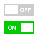
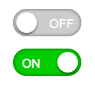
So as the world gets more and more mobile people are getting used to seeing the toggle switches seen on iPhone/iOS and Android user interfaces. They are very intuitive and downright fun, and much easier to use than checkboxes. I'm working on a project that has a user interface that calls for this so I decided to extend the Super Simple Fancy Checkbox Plugin by Dave Macaulay by cleaning it up a bit and creating some fun flat style toggle switches. Flat design is quite popular now and being the minimalist I am it's like heaven for me. You could easily alter the css on these to be more 3d with some gradients/shadows/radius.(See "Bonus Styles" below)
Visual and Working Examples
What it looks like (non functioning)

Full Code and Working Example
How it works
This is so easy to implement.. it's fantastic. Essentially you build your form how you normally would using input type="checkbox" and then using a little jQuery we hide the original input and create a new div class="tog" which is the toggle. Then when you click the toggle it adds / removes class="on" from the element and adds/removes checked from the hidden input so your form will submit the data as expected :)
The HTML
Your form just needs to have a checkbox input with a name and id.
<input id="toggle1" type="checkbox" name="toggle1" />
The Jquery (put this in the head or external JS file)
<script src="//ajax.googleapis.com/ajax/libs/jquery/1.8.1/jquery.min.js"></script>
<script>
/* Super Simple Fancy Checkbox by davemacaulay.com updated by schoberg.net  */
(function( $ ) {
    $.fn.simpleCheckbox = function(options) {
        var defaults = {
            newElementClass: 'tog',
            activeElementClass: 'on'
          };
        var options = $.extend(defaults, options);
        this.each(function() {
            //Assign the current checkbox to obj
            var obj = $(this);
            //Create new element to be styled
            var newObj = $('
<div/>', {
                'id': '#' + obj.attr('id'),
                'class': options.newElementClass,
                'style': 'display: block;'
            }).insertAfter(this);
            //Make sure pre-checked boxes are rendered as checked
            if(obj.is(':checked')) {
                newObj.addClass(options.activeElementClass);
            }
            obj.hide(); //Hide original checkbox
            //Labels can be painful, let's fix that
            if($('[for=' + obj.attr('id') + ']').length) {

                var label = $('[for=' + obj.attr('id') + ']');
                label.click(function() {
                    newObj.trigger('click'); //Force the label to fire our element
                    return false;
                });
            }
            //Attach a click handler
            newObj.click(function() {
                //Assign current clicked object
                var obj = $(this);
                //Check the current state of the checkbox
                if(obj.hasClass(options.activeElementClass)) {
                    obj.removeClass(options.activeElementClass);
                    $(obj.attr('id')).attr('checked',false);
                } else {
                    obj.addClass(options.activeElementClass);
                    $(obj.attr('id')).attr('checked',true);
                }
                //Kill the click function
                return false;
            });
        });
    };
})(jQuery);

$(document).ready(function(){

// replace checkboxes with Toggles
$('input:checkbox').simpleCheckbox();

});// end document.ready
// ]]></script>
You'll note at the very end is where I actually call it. In my example I'm hitting all checkboxes. You can easily change that by say putting id="userform" or whatever on your form tag and then replacing input:checkbox above with #userform input:checkbox
CSS
/* === Start Schoberg.net Toggle Switches === */
div.tog{display:block;margin:1em auto;height:40px;width:100px;position:relative;cursor:pointer;font:18px/18px arial;background:#ccc;
-webkit-transition: all .2s ease;-moz-transition: all .2s ease;-o-transition: all .2s ease;transition: all .2s ease;}
div.tog:after{content:'';display:block;height:30px;width:40px;background:#fff;position:absolute;top:5px;left:5px;
-webkit-transition: all .2s ease;-moz-transition: all .2s ease;-o-transition: all .2s ease;transition: all .2s ease;}
div.tog:before{content:'OFF';position:absolute;right:11px;top:12px;color:#fff;}
div.tog:hover:after{left:10px;}
div.tog.on:before{content:'ON';right:60px;}
div.tog.on{background:#0c0;}
div.tog.on:after{left:55px;}
div.tog.on:hover:after{left:50px;}
/* === End Schoberg.net Toggle Switches === */
Bonus Styles!
OK don't dig the flat square look? Here's an example of something a bit more "realistic".

